Data Visualisation
Internship Project (Solo)
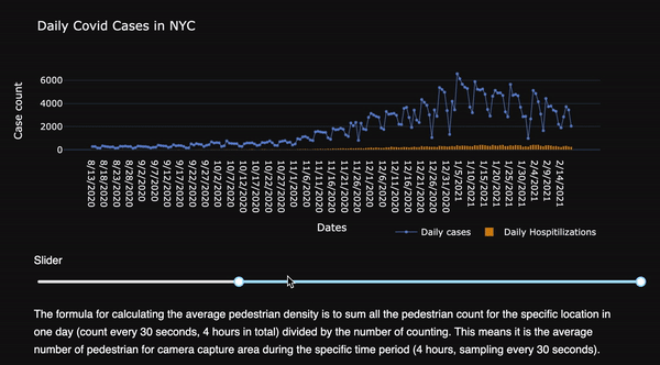
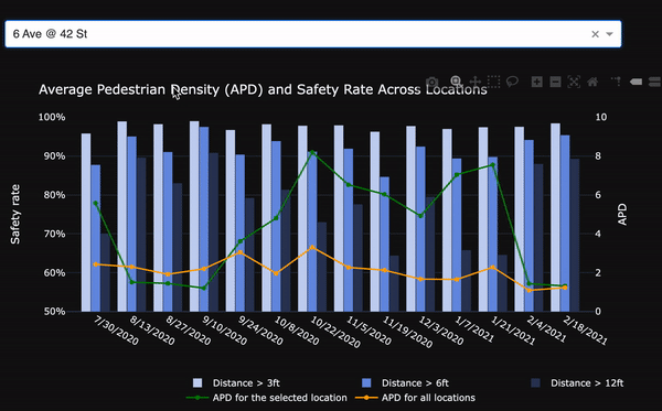
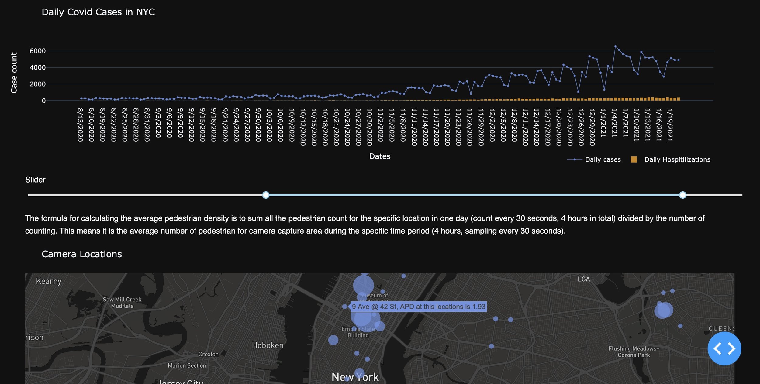
As a part of my internship at C2SMART Center, I created an interactive dashboard for their website. It’s part of their Covid-19 related pedestrian research and visualizes pedestrian density across different parts of NYC during the pandemic as well as Covid-19 data.
Tools used: Python, Plotly